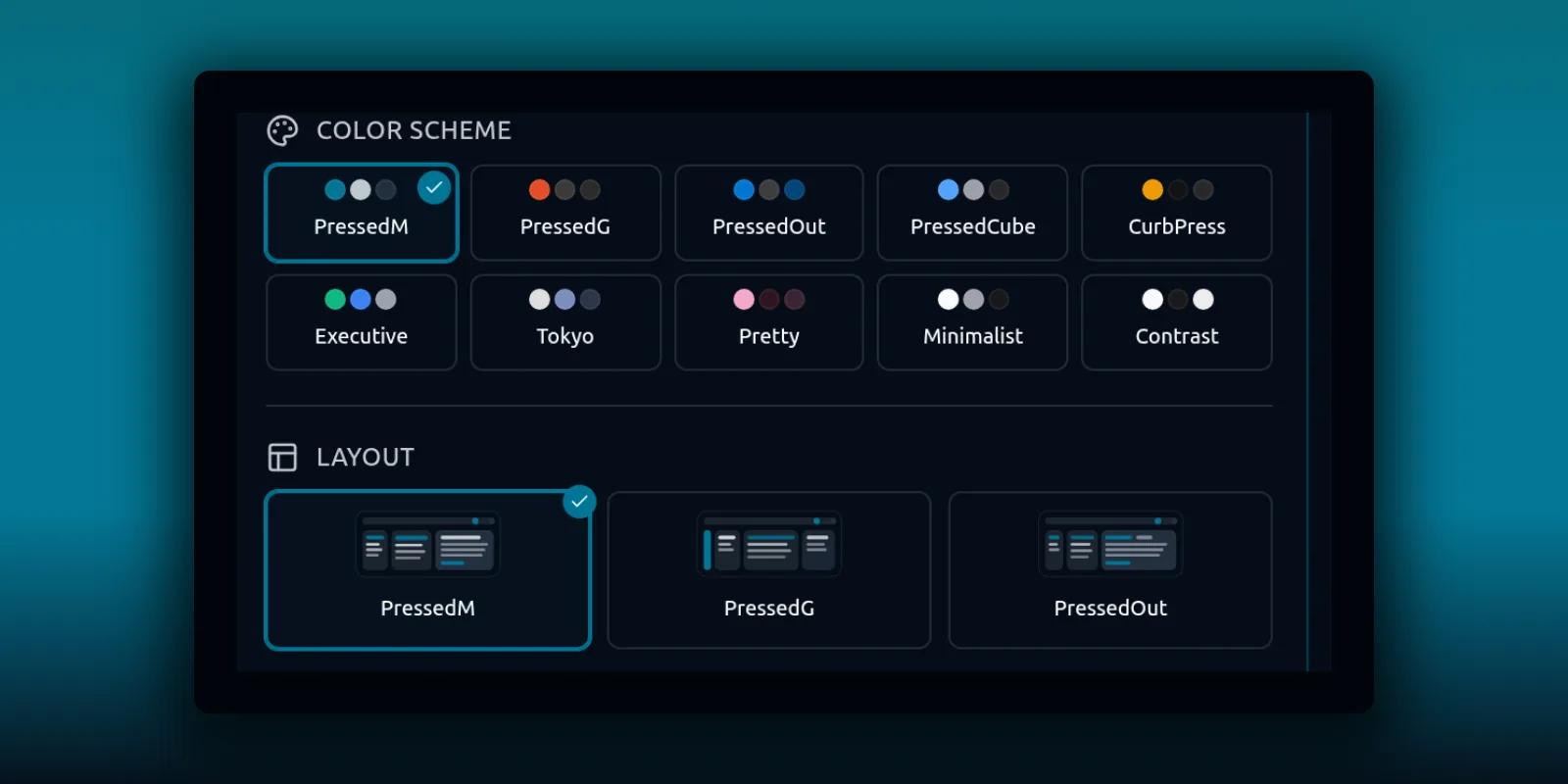
You will spend a lot of hours in your mailbox, so it is worth making it comfortable. PressedMail has one popover in the header that controls the look: light or dark, the color scheme, the layout of the inbox, the font, and which extras sit around the edges.
This guide goes through it control by control. It also covers the smaller Free version, the choices an administrator can lock, and the separate setting for language.
Open the Theme popover
Click Theme in the header. It is the brush icon among the buttons at the right.
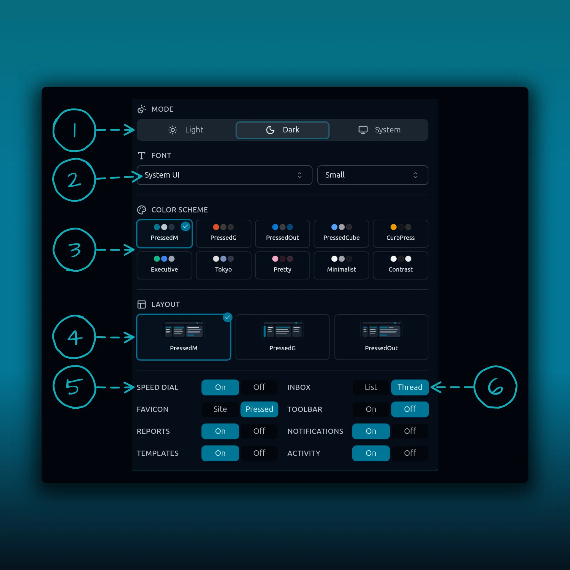
- Mode. Light, Dark or System.
- Font family, with the size menu beside it.
- Color scheme. Ten swatches.
- Layout. Three inbox layouts, each shown as a small preview.
- Speed dial, one of the display rows at the bottom.
- Inbox, the row that switches between List and Thread.
Every change applies at once, and it is saved to your own preferences. A teammate who opens PressedMail sees their own look, not yours.
Light, dark or system
Light and Dark do what they say. System follows your device, so PressedMail turns dark in the evening when your operating system does. Browsers pass that choice to websites through a standard setting called prefers-color-scheme.
Font and size
The Font menu sets the family and the menu beside it sets the size. On the demo site in the screenshot above, the font is System UI at a small size. System UI uses whatever typeface your device already draws well. If you read a lot of long mail, raise the size before you reach for another family. It usually helps more.
Ten color schemes
The color scheme sets the accent colors across buttons, selected rows and badges. The ten are PressedM, PressedG, PressedOut, PressedCube, CurbPress, Executive, Tokyo, Pretty, Minimalist and Contrast.
Contrast uses black and white and is the one to try if you want the sharpest difference between text and background. A scheme looks different in light and dark, so try both before you settle.
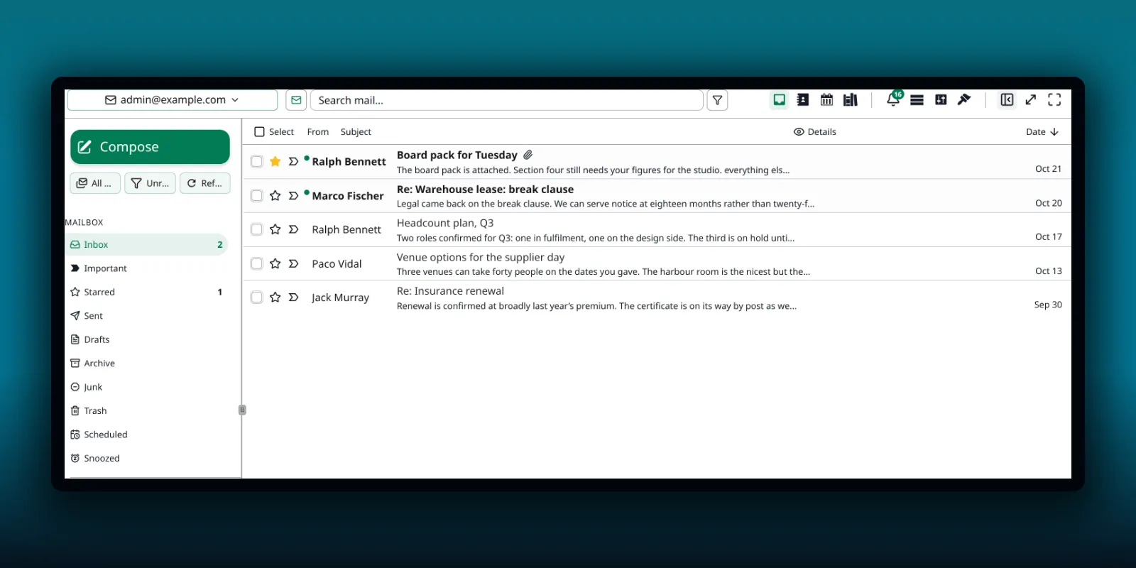
The same inbox in light mode with the Executive scheme and the PressedG layout.
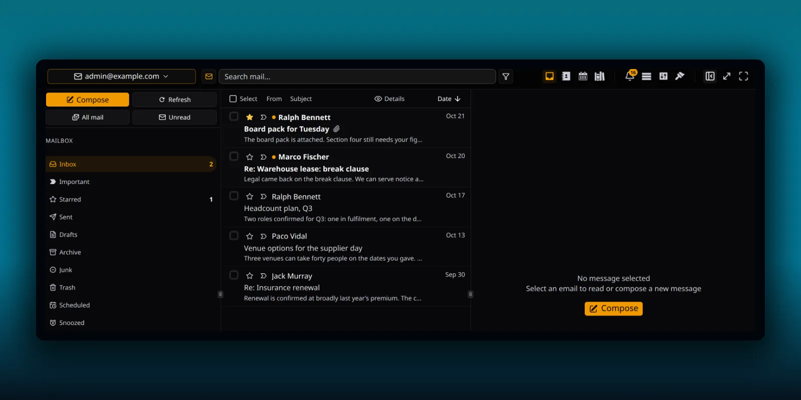
And in dark mode with the CurbPress scheme.
Three layouts
The Layout section shows three previews: PressedM, PressedG and PressedOut. Each arranges the folders, the message list and the reading pane in its own way. Click one and the inbox rearranges without a reload. The tour of the main screen names each region if you want to find your way around a new layout.
The display rows
Under the layout previews sit rows of On and Off buttons. Each one turns one piece of the interface on or off for you.
- Speed dial, the round button in the corner that fans out shortcuts.
- Inbox, with List or Thread. Thread groups a conversation into one row.
- Favicon, with Site or Pressed. It sets the icon on the browser tab.
- Toolbar.
- Reports.
- Templates.
- Notifications, the bell in the header.
- Activity, the link at the right end of the status bar.
Turning off something you never use makes the header calmer. It does not remove the feature. You can switch it back on from the same place. If you switch off Notifications, the notifications guide explains what the bell controls first.
What the Free build shows
The Free plugin has a smaller popover called Appearance. It keeps Mode, the font family and size, the Inbox row with List or Threaded, and Speed Dial. The color scheme section offers two schemes, PressedM and Contrast, and the layout section offers one, PressedM. The full set of ten schemes and three layouts is part of the paid builds. The plan guide lists what else changes between them.
On a paid build you may see a lock on some swatches. A lock with the Pro label means the current license does not include that choice. A plain lock means an administrator has limited it.
When an administrator limits the choices
A site owner can set a default look and decide whether people may change the theme, the mode and the layout at all. They can also shorten the list of available themes, as long as one stays. A theme they switch off disappears from your popover. If they turn off theme switching, the other swatches show a lock. Those settings live under Branding and Appearance in the admin settings, and the white-label guide walks through them.
Language
The interface language is a separate preference. Open Settings, then Preferences, then Language. The card says it changes only the PressedMail interface for your account, and it adds that some text remains in English.
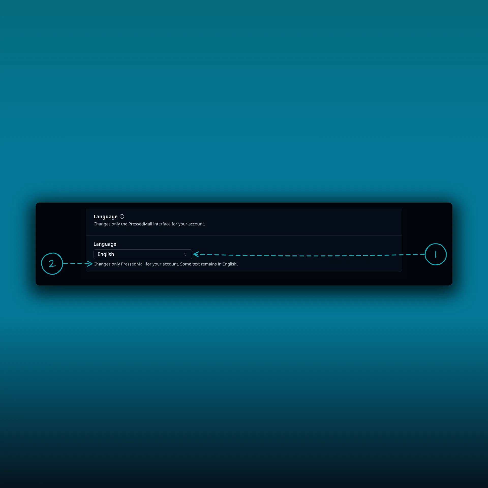
- The language menu. It is set to English on this site.
- The note under it, which says some text remains in English.
A quick set of starting points
If you are unsure where to begin, set Mode to System, keep the default scheme and layout, and raise the font size by one step. Turn off the rows you never touch. After a week, try one other scheme and see whether you miss the first. The keyboard shortcuts guide is the next thing to learn once the screen feels right.
Frequently asked questions
Where is the Theme button?
In the header, among the buttons at the right. On the Free plugin it is called Appearance.
Does my theme choice affect other users?
No. It is saved to your own preferences.
Can I make PressedMail match my site’s brand?
Administrators on paid builds can do that with white label settings. Individual users choose from the available themes.
Why can I not pick some color schemes?
A Pro lock means your license does not include them. A plain lock means an administrator turned off theme switching. A theme the administrator switched off does not show at all.
Does the language setting change my WordPress language?
No. It changes the PressedMail interface for your account only.
Manage your email inside WordPress
PressedMail Free adds an email client directly to your WordPress dashboard. Connect a compatible IMAP/SMTP mailbox, read and send mail, organize messages, and configure WordPress SMTP.